Comparison of Bulk RNA-seq Data Visualization Tools
Kriti Srivastava
May 17, 2023
Kriti Srivastava
May 17, 2023
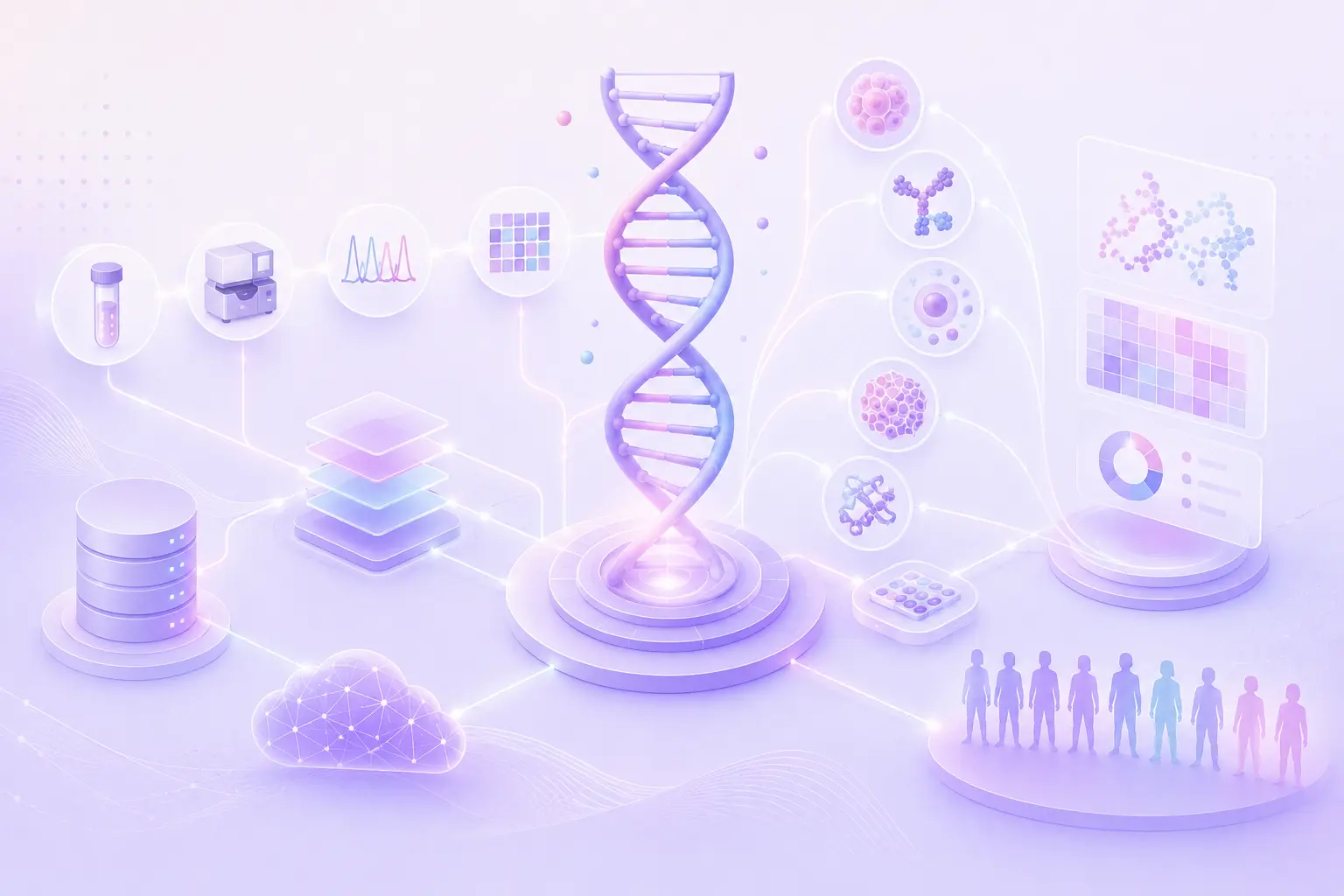
The rise of modern gene expression profiling techniques, such as bulk RNA sequencing, has generated a wealth of high-quality datasets spanning all fields of current biological research.
Bulk RNA-Seq is the method of choice for transcriptomic analysis of pooled cell populations, tissue sections, or biopsies.
It measures the average expression level of individual genes across hundreds to millions of input cells and is useful for getting a global idea of gene expression differences between samples. The downstream analysis results can be visualized using many plots like PCA, volcano plots, heatmaps, scatter plots, box plots, etc.
In this blog, we will compare a few features of different web-based applications used to visualize bulk RNA-Seq data.
Challenges in Visualizing This Data
There are 3 main challenges in visualizing bulk RNA-Seq data.
Normalization Data normalization is a critical step in bulk RNA-seq data analysis. However, it can be challenging due to variations in library size, composition bias, technical variability, and RNA splicing and isoform diversity. Choosing an appropriate normalization method that accurately represents the underlying biology is essential for accurate interpretation of the data.
Dimensionality Bulk RNA-seq data is high-dimensional, with thousands of genes and many samples. Visualizing high-dimensional data is difficult because it is challenging to accurately represent all the information in a single plot. Dimensionality reduction techniques like PCA, t-SNE, and UMAP can be used to reduce the number of dimensions and represent the overall structure of the data.
Variability Variability in bulk RNA-seq data can be both within and between samples. This variability can obscure biological patterns and make it difficult to accurately represent the data in a visualization. Visualization methods should be chosen carefully to account for this variability and accurately represent the underlying biology.
Widely Used Bulk RNA-seq Data Visualization Tools
Let’s look at a few of the most popular web-based tools for visualizing bulk RNA-sequencing data.
Phantasus – Phantasus is a web application for visual and interactive gene expression analysis. Phantasus is based on Morpheus – a web-based heatmap visualization and analysis software integrated with an R environment via OpenCPU API. Phantasus supports basic visualization such as heatmaps, filtering methods, R-based methods such as k-means clustering, principal component analysis, and differential expression analysis with the limma package.
DEIVA - DEIVA (Differential Gene Expression Interactive Visual Analysis) is a web app to interactively identify and locate genes in a hexbin or scatter plot of DESeq2 or edgeR results. The aim was to create a web app that meets user expectations and can be used without R, spreadsheets, or programming knowledge.
JBrowse - JBrowse is a genome browser with a fully dynamic AJAX interface, being developed as the eventual successor to GBrowse. It is very fast and scales well to large datasets. JBrowse is javascript-based and does almost all of its work directly in the user's web browser, with minimal requirements for the server.
BrowserGenome - a web-based deep-sequencing data-analysis platform offering barcode deconvolution, read mapping, real-time data visualization, transcript-count analysis, and data normalization. BrowserGenome is specifically focused on evaluating mRNA-seq data, but it can easily be extended to other applications.
Features
Phantasus
DEIVA
JBrowse
BrowserGenome
Requires server for computation
No
Yes
Minimal requirements
No
Open source
Yes
Yes
Yes
Yes
Can be incorporated with 3rd party websites
Yes
No
Yes
Yes
Data Input format
GCT file
Tab or comma-separated ASCII describing the result of a DGE statistical test
Supports GFF3, BED, FASTA, Wiggle, BigWig, BAM, VCF (with tabix), REST, and more.
Uses raw sequencing data in FASTQ format or imports mapping results from other software in SAM format
In-built Workflow
Data loading, normalizing and filtering data to doing differential gene expression and downstream analysis
Data loading, normalizing, differential expression analysis, hierarchical clustering, gene ontology analysis and visualization
Data loading, Indexing the genomic data, Track creation that display the genomic data, including annotations, variants, and experimental data., Configuration of display settings for each track, Navigation (zooming, panning, and searching), Data analysis
The graphical user interface displays the genome as a dynamic circle, with the mapping density displayed eccentrically. The user can upload the data and navigate through the data using a mouse, with gestures similar to those used in web applications such as Google Maps
Output / Downstream analysis
Differential gene expression using limma or DESeq2
Interactively identify and locate genes in a hexbin or scatter plot of DESeq2 or edgeR results.
Write the result of a differential expression test to a file with TAB or COMMA as the separator and no hyphens to delineate fields as per choice.
Outputs binary or SAM-format mapping results or transcript-count tables.
Plots
Publication ready plots with export to SVG: PCA plot, row profiles, box plots
Volcano plots, heatmaps, scatter plots principal component analysis (PCA) plots
Coverage plots, multiple alignment views, variants and SNPs as tracks on the genome browser view.
The circular representation of the genome can be intuitively moved and zoomed with mouse. Up to six tracks of deep-sequencing data can be displayed as concentric circles, and even large data sets can be visualized in real time.
Sharing among researchers
Sharing session links
Yes
Yes
No
Main features
1. Clustering: k-means and hierarchical.
2. Gene set enrichment analysis via fgsea package.
DEIVA provides an interface where domain experts simply go to a URL and can immediately search for genes, retrieve genes, and filter results lists.
1. Fast, smooth scrolling and zooming. Explore your genome with unparalleled speed.
2. Scales easily to multi-gigabase genomes and deep-coverage sequencing.
Matches the speed and memory footprint of state-of-the-art software while being visually driven and intuitive to use.
Although bulk RNA-Seq has prevailed as the major technique for studying genome-wide gene expression profiles, the user communities are still struggling to create gold standards encompassing all related data analytics stages. While the data generation and analysis steps are well-defined and tools for each step are generally mature, there is a lack of integrated solutions covering most of them, from data management and genome browsing to biologically relevant outcomes. Users must look for web-based or stand-alone applications for downstream analysis and visualization.
However, Phantasus, a third-party application on Polly, can expedite bulk RNA-Seq data processing because Polly offers the world's most extensive collection of well-curated ML-ready bulk RNA-Seq data. These datasets have been metadata harmonized, which makes the bulk RNA-seq data visualization and analysis process smoother. The input file (.GCT format) is accessible for various publicly available data sets on our platform. Researchers can use Phantaus on the Polly platform with either a graphical user interface or a programmatic interface to access, view, and study these carefully maintained datasets.
.svg)


.svg)
.svg)


%201%20(1).svg)


.svg)
%20(1).svg)


